We live in a world where, if you want something to freak about about, you need look no farther than the internet browser on your phone. Whatever scenario seems most nightmarish to you, you can find ample evidence to stoke that particular fire. But if climate change fallout is your brand of freakout bait, now there's an online tool that is as strangely meditative as it is disturbing.
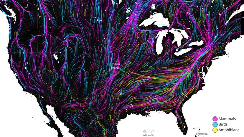
The University of Washington and The Nature Conservancy have created an interactive map called Migrations in Motion that estimates the direction in which animals in the Western Hemisphere — including birds, mammals and amphibians — will need to move in order to survive what climate change has in store for all of us.
Advertisement
"This is the best visualization of any of these studies we've done. It's much more compelling than our static maps," said Joshua Lawler, a professor in the University of Washington School of Environmental and Forest Sciences and lead author of the 2013 study that led to the creation of the map, in a press release. "The flow diagram really makes the data much more accessible."
The researchers modeled the habitat needs and projected habitat change for nearly 3,000 species in North and South America. They then plotted the best escape route for each animal through connected habitats with a flow model from electronic circuit theory — you may have seen a similar visual models charting the prevailing winds around the world. The map shows the most obvious migration path for each species (color-coded by class of animal) to create something both educational and altogether trance-inducing. That seems like a win-win, until you consider the fact that you're looking at a map that charts with astounding precision the slow-yet-final death marches of thousands of animals. But that brief moment of hypnosis was nice, wasn't it?
If you zoom in and see your neighborhood depicted with a massive flow of animals, don't set the traps or build an ark yet — the map's an estimate that's accurate only to 31 miles (50 kilometers), which is still pretty staggering when you consider we're talking continents and entire species here.
Where will all these animals go, you ask? In the Eastern United States, the Appalachians will most likely provide the elevation lift and the clear path north that many species will need to take in order to survive in the coming decades and centuries. In the West, mountain ranges such as the Cascades and the Rockies will provide the best path north to cooler climates. Some animals will most likely migrate to protected areas like Yellowstone National Park and to the tops of mountains. In South America, the most notable migration will be of all kinds of animals out of the Amazon, to the western half of the continent.
Though depressing, a map like this (if you haven't already, click here to check out Migrations in Motion) is useful, especially one so precise. It takes the guesswork out of deciding which habitats to restore, or prioritize or keep connected. We've got our marching orders; the climate refugees of the future will thank us later.
Advertisement